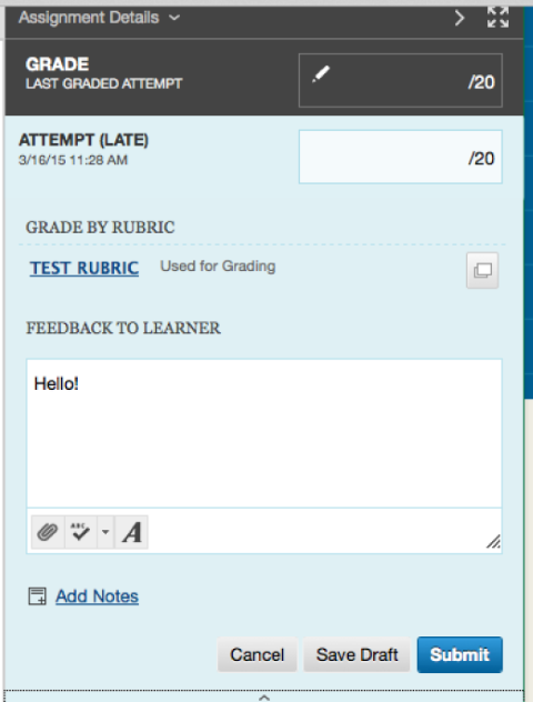
BB Learn Grading Assignments -- Display Issue
You may encounter an issue where the feedback to user box is obscured by a semi-transparent gray box with the "Cancel," "Save Draft," and "Submit" buttons, as shown in the screenshot below.
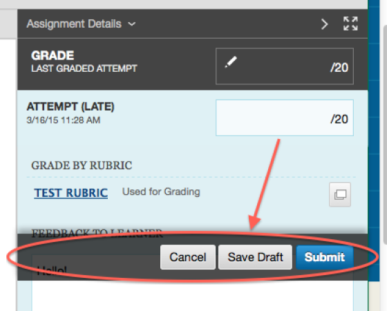
The instructions below on the next pages will provide a work-around solution for dealing with this issue.
- Scroll
down on the page until you see the tiny up arrow or "^" below the "Add
Notes" section and circled in the example screenshot below. Click the
tiny up arrow.
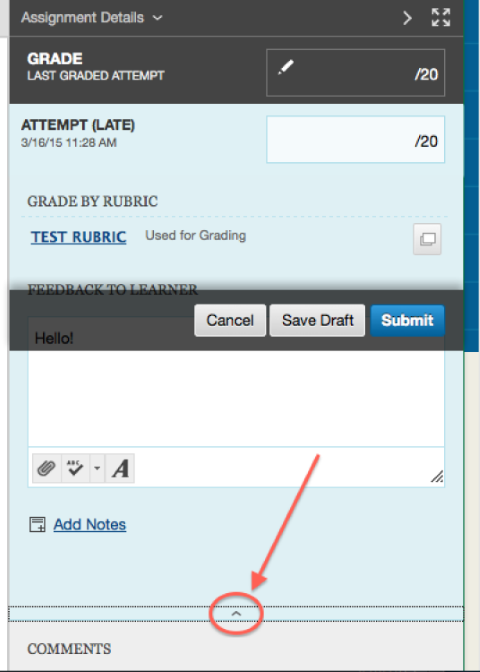
- Now
scroll down the page so that "Assignment Details" circled in the
example screenshot appears at the top of your internet browser window.
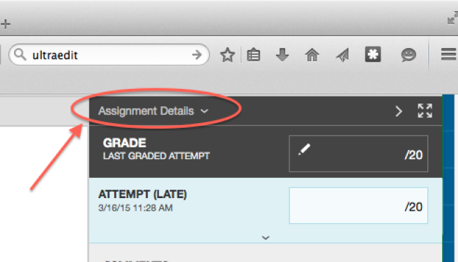
- Now
expand your internet browser window so that it fills up your entire
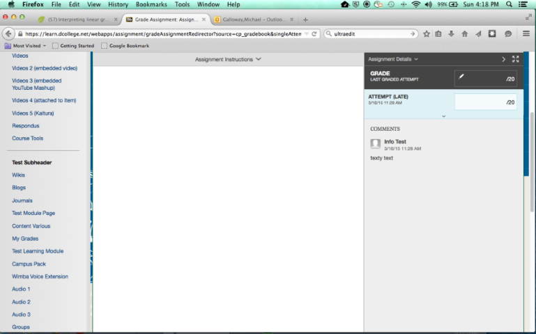
desktop. After this step, your internet browser window should look
something link this, with "Assignment Details" at the top of the window
and lots of empty gray area beneath the "ATTEMPT" area.
- Now click the tiny down arrow circled in example screenshot below.
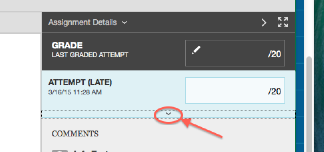
- Now you should see the "FEEDBACK TO LEARNER" area unobscured.
